
Brand Identity & Web Design — In Progress
CreativeFlow is a social media agency built on a simple idea: you can be reliable and creative at the same time. My job was to bring that idea to life across their full visual identity - from logo to colour system to web design.
The logo blends a bold, structured sans serif with a loose, hand-drawn script, capturing the tension between dependability and creative freedom that defines the brand. That same balance carries through the colour palette - energetic oranges and pinks grounded by deep charcoal and soft neutrals - and into the website, currently in development, where clean layouts meet fluid, motion-inspired visuals.
This is an ongoing project, with the full site and additional brand assets still being built out in stages.
The Logo Mark
Reliability and creative freedom.
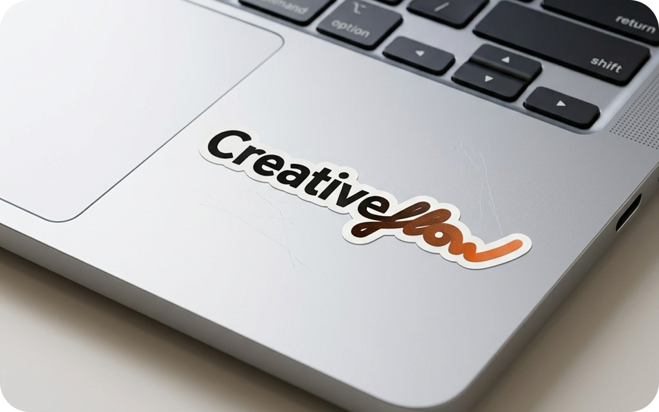
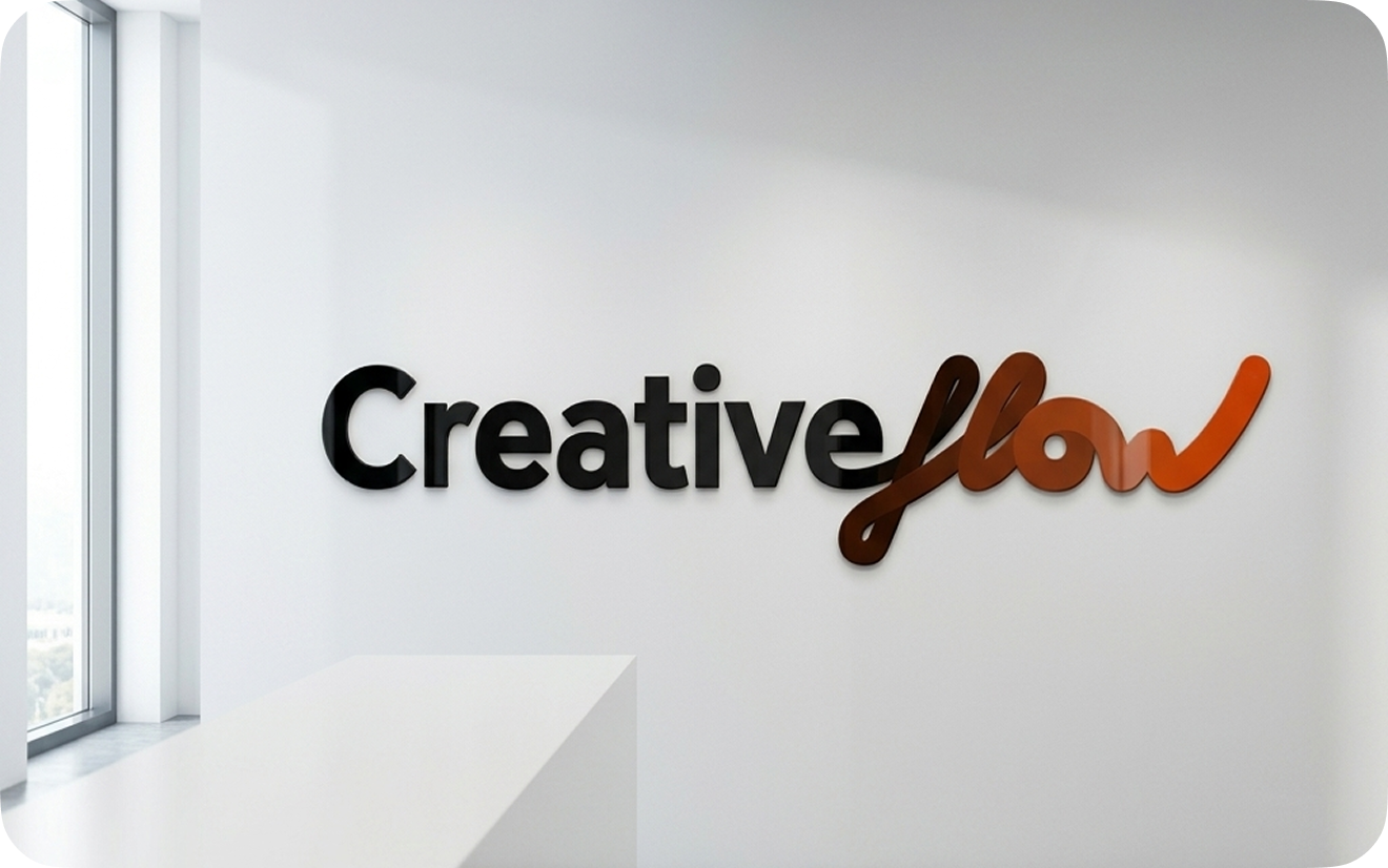
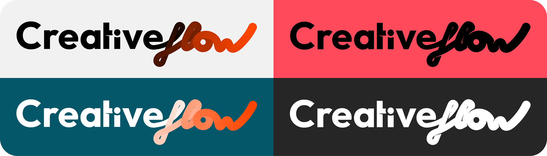
The wordmark pairs a bold, geometric sans serif for "Creative" with a loose, hand-drawn script for "flow" - a deliberate contrast that tells the brand's story at a glance. The sans serif grounds the identity, signaling structure, confidence and consistency: this is an agency that delivers. The flowing script breaks from that rigidity, introducing movement, spontaneity and a human touch - a nod to the agency's willingness to experiment, take risks and think outside the lines.
Together, the two type styles create tension that resolves into balance: sturdy but never stiff, creative but never chaotic. The gradient treatment on "flow" (from deep espresso to vivid orange) reinforces that sense of energy and motion, while the logo remains fully functional in solid black, white, and reversed-on-dark variations for real-world flexibility across platforms.
The Colours
The palette was built to match the energy of the brand: warm, bold, and impossible to ignore.
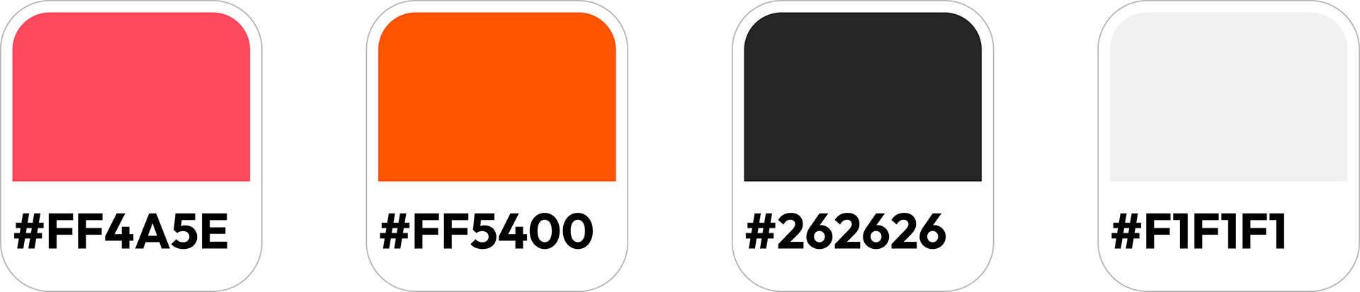
#FF4A5E - A vibrant coral-pink that brings warmth and approachability, used to soften the boldness of the primary orange and add depth to gradients.
#FF5400 - The hero colour. A confident, energetic orange that drives attention to key actions and reinforces the "creative" side of the brand - bold without tipping into aggressive.
#262626 - A near-black charcoal that grounds the palette, providing the structure and contrast needed to keep the brighter tones from feeling chaotic.
#F1F1F1 - A soft off-white used for backgrounds and breathing room, letting the brighter colours do the talking without overwhelming the eye.
Together, the palette mirrors the logo itself: sturdy, neutral tones balanced against vivid, creative pops of colour - proof that the brand can be bold and dependable at the same time.
Web Design
Currently in development
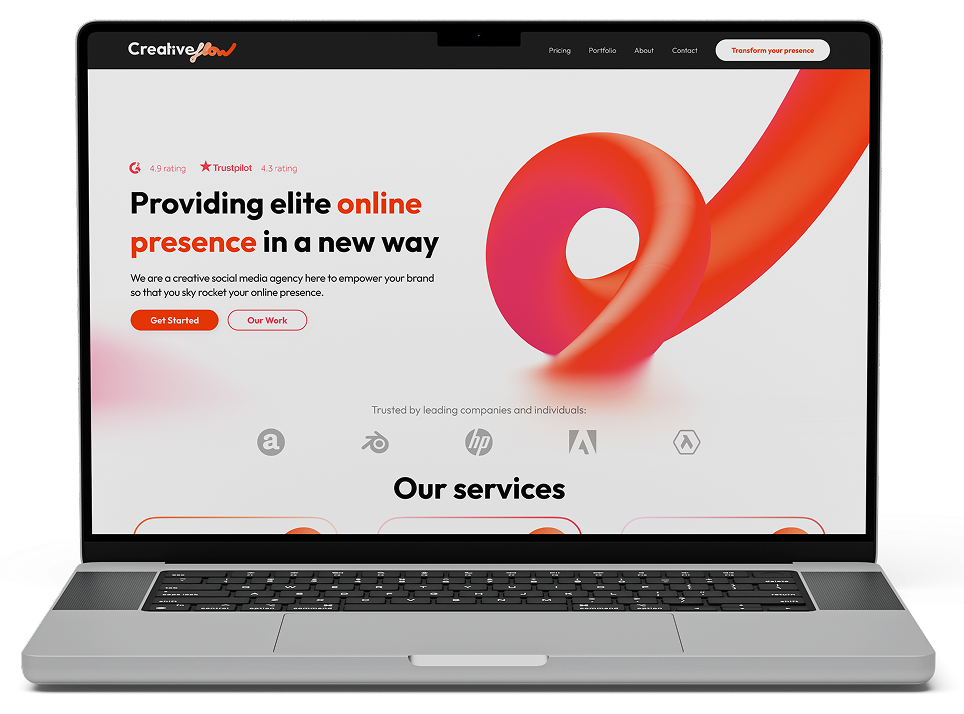
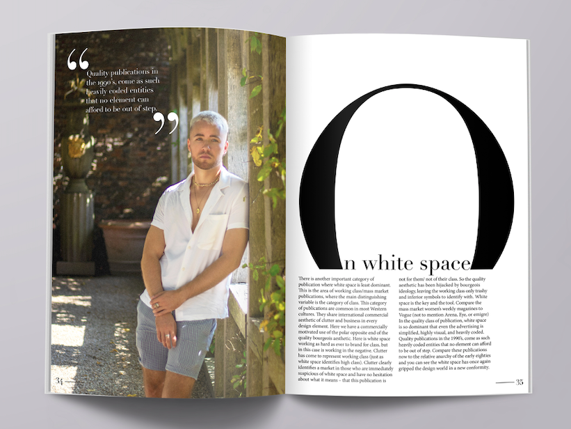
The goal for the website was to let the design practice what the agency preaches: if CreativeFlow promises clients bold, elevated online presence, the site itself needed to prove it. Every element — from the fluid, gradient-driven hero graphic to the confident typography and generous use of white space — was built to feel premium and intentional, moving away from generic agency-template layouts.
The logo's contrast between structure and creativity carries through into the UI: clean, grid-based sections keep the layout easy to navigate, while pops of color, motion-inspired shapes, and organic curves inject the energy and personality that define the brand. The result is a site that feels trustworthy and established, without losing the creative edge that sets the agency apart.